
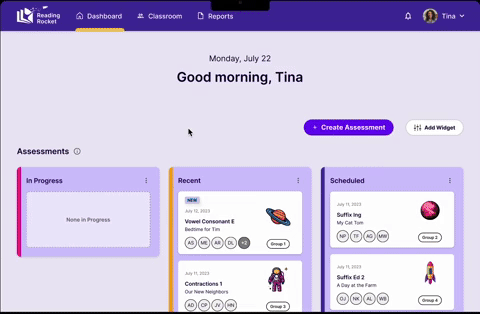
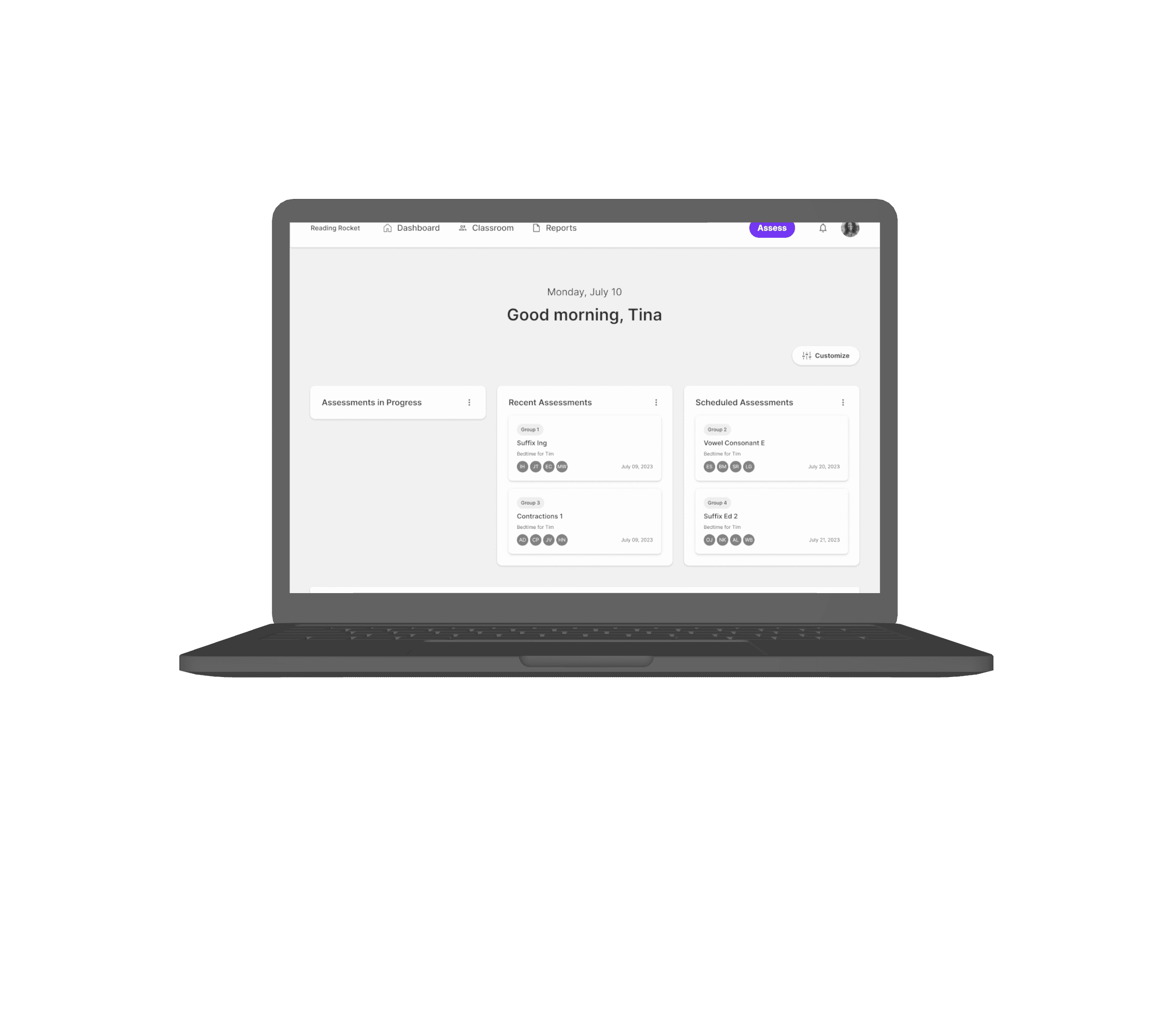
A responsive design for a new app, Reading Rocket, with an emphasis on desktop design. My team spent five weeks researching, interviewing, creating, and testing a completely new product based on client concepts and ideas. Taking the needs of educators into consideration, my team was able to create a design that leverages AI to help educators manage and conduct short-form reading assessments for students ages 5-8. During this sprint, my team focused on designing for the educator’s point of view; creating a dashboard, a flow for conducting short-form assessments, and a place for educators to review the assessment results that AI had captured. Here's a look at our final prototype:


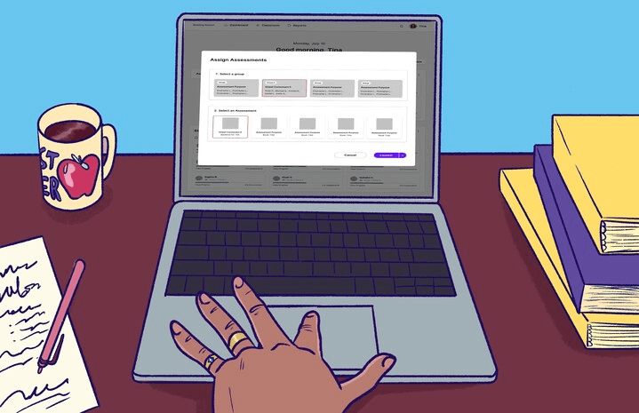
Tina selects the group she wishes to assess and assigns them a leveled text
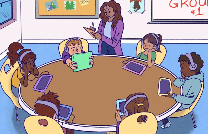
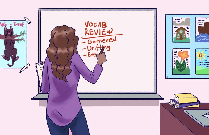
Tina calls the group over and sets them up to begin the assessment. During the assessment, Tina walks around and monitors the group, taking notes on paper.

The first group of students finishes the assessment, so Tina calls over the next group to get them set up.
Later, Tina returns to her desk when the kids go to recess and reviews the students’ reports from the assessment conducted earlier that day.
When finished, Tina closes her laptop and begins preparing her lesson plan based on insights derived from Reading Rocket.

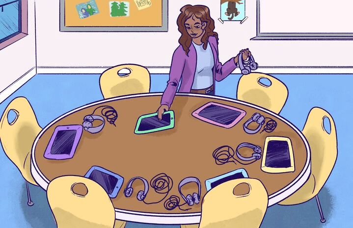
Tina prepares to conduct a reading assessment by setting up a round table for a small group of students, distributing a tablet and headset for each student.
Project Scope
Conduct research to discover and define the needs and behaviors of Reading Rocket's users (educators) in regards to conducting short-form reading assessments.
Design and test a clickable, AWS Amplify-optimized Figma prototype for Reading Rocket's landing page and student assessment review page, to demonstrate how a user creates, assigns, and reviews a short-form reading assessment.
Create a storyboard to illustrate how Reading Rocket's short-form reading assessment feature could be utilized in a classroom setting.

Chloé D.
UX Research Lead

Mathias D.
Project Manager

Tony F.
Product Designer

Nawid P.
Product Designer


Abir M.
UX Deisgner
Meet the Team
Research
The other large part of was learning the terminology that educators are using in the classroom, relevant to our scope of the project. Reading Rockets, Keys to Literacy, and Massachusetts Department of Reading were some of the primary sites used to help define a lot of terms like Zone of Proximal Development, Phonemes, and so on.

A large part of our project was finding a place to start with a product that is just starting to break ground in the community. I lead my team in evaluating each competitor site to solidify our understanding of what features already exist in similar products, giving us an idea of what the industry standard is. This provided the team with a good starting point to identify our users needs and wants

User Interview Objectives
To bridge the gap between existing research and actionable design insights, the following interview objectives were defined:
Discover how teachers are currently conducting reading assessments
To find out what challenges educators are facing when conducting reading assessments
To understand what technology is available in the classroom and what technology is being used during reading assessments
To learn what metrics are being measured after conducting reading assessments

User Interviews
To achieve these objectives, my team conducted remote interviews that were designed to allow open-ended exploration while ensuring consistency across participants. Interview questions were crafted to align with the defined objectives. These were the insights formed that helped build the foundation for our targeted design, as well as define our persona:
Our users prefer to use pen and paper to take down notes during reading assessments
Our users do not use a lot of technology in the classroom
Time constraints and interruptions are the biggest challenges for our users
Students are grouped based off of initial, formal assessments, as well as focus areas they’re struggling in
There are A LOT of methods used to keep students engaged
Persona
Meet our persona, Tina. Tina served as the focal point for our prototype development. Shaped by the diverse needs, preferences, and paint points of real users, Tina stands as a testament to creating a truly user-centric experience.

Name: Tina
Occupation: First Grade Teacher
Age: 45
Frustrations:
Lacks time to complete reading assessments
Often interrupted when conducting reading assessments
Doesn’t like the idea of AI in the classroom
Needs:
A way to easily assess students for their decoding abilities
A simple method to assign relevant, pinpointed reading material for the student’s assessment
A quick means of accessing student data
An easy way to record and keep track of her notes from the reading assessments
Design Principals
Before my team jumped into the design phase, we leveraged the insights gained from our user research to formulate a set of four guiding principals. These principals were created to serve as the foundation for our user-centric design process:
Simplicity- Ensure easy navigation without unnecessary complexities by keeping the interface clean and intuitive. Use clear and concise language, minimizing cognitive load.
Accessibility- Ensure that the application is accessible to a diverse range of users, considering factors such as font size and color contrast.
Efficiency- Streamline the workflow by minimizing the number of steps required to complete common tasks. Provide shortcuts, automation features, and efficient data entry options to save time and reduce repetitive actions.
Data Analysis and Insights- Provide tools for analyzing student progress, identifying areas for improvement, and generating actionable insights. Visualizations, data, dashboards, and reports that can assist Tina’s understanding of student performance trends to help make informed instructional decisions.
Lofi Wireframes
With our design principals at the forefront, our lofi wireframes encapsulate our commitment to user-centric and methodical design. The team created a prototype that would walk Tina through an everyday task of conducting and reviewing a short-form reading assessment.

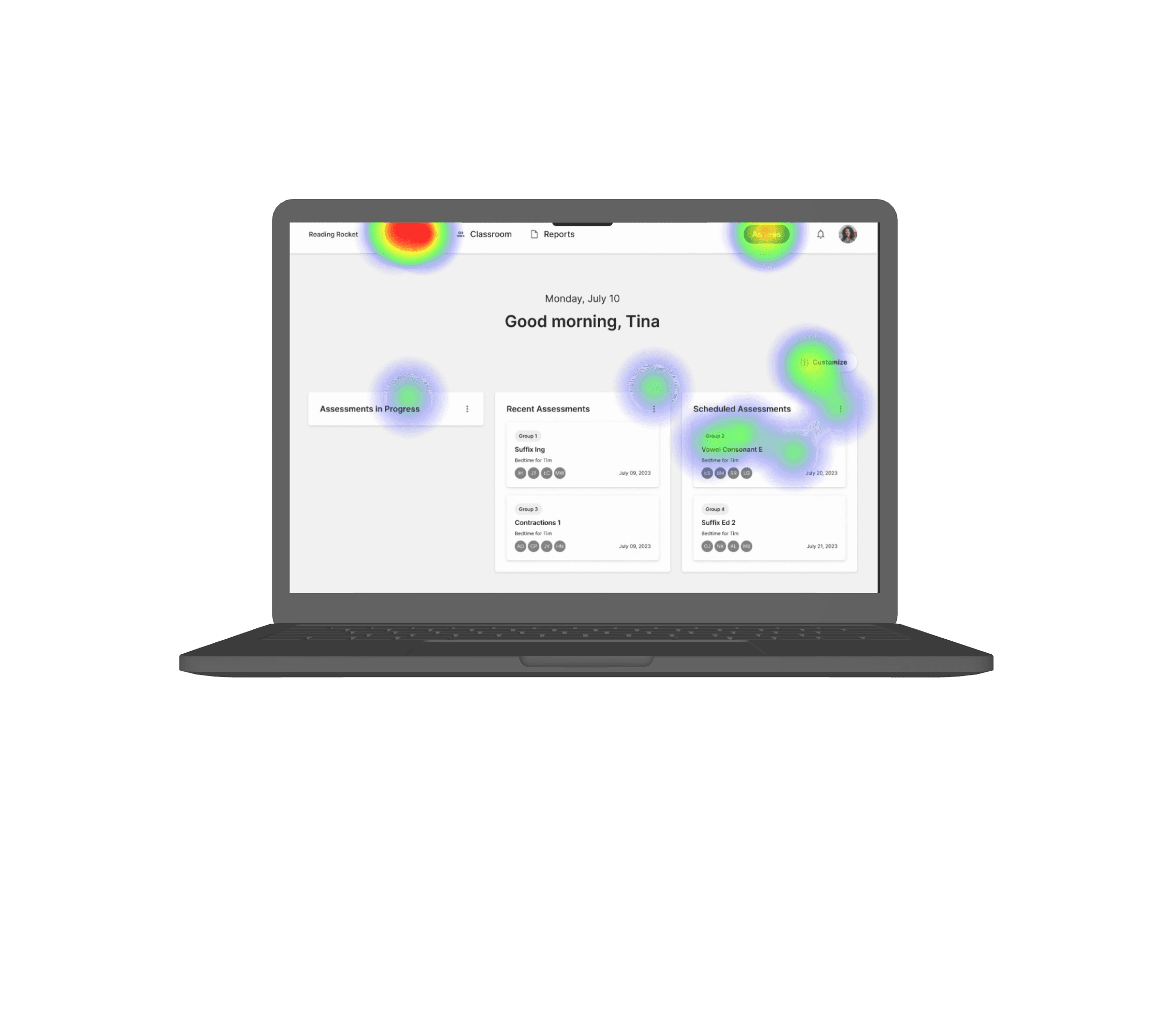
Usability Testing
Once our low fidelity prototype was built, we set out to test two different flows. We conducted moderated testing for both flows over Zoom, with the assistance of Maze. For the first flow, we tested to see if our users could quickly and easily launch a new short-form reading assessment to a group of students. These are the results from testing our first flow:
Users mis-clicked 50% of the time
Users moved on to the next screen with a success rate of 75%
Users felt unclear as to how to launch an assessment, as illustrated on this heat map:
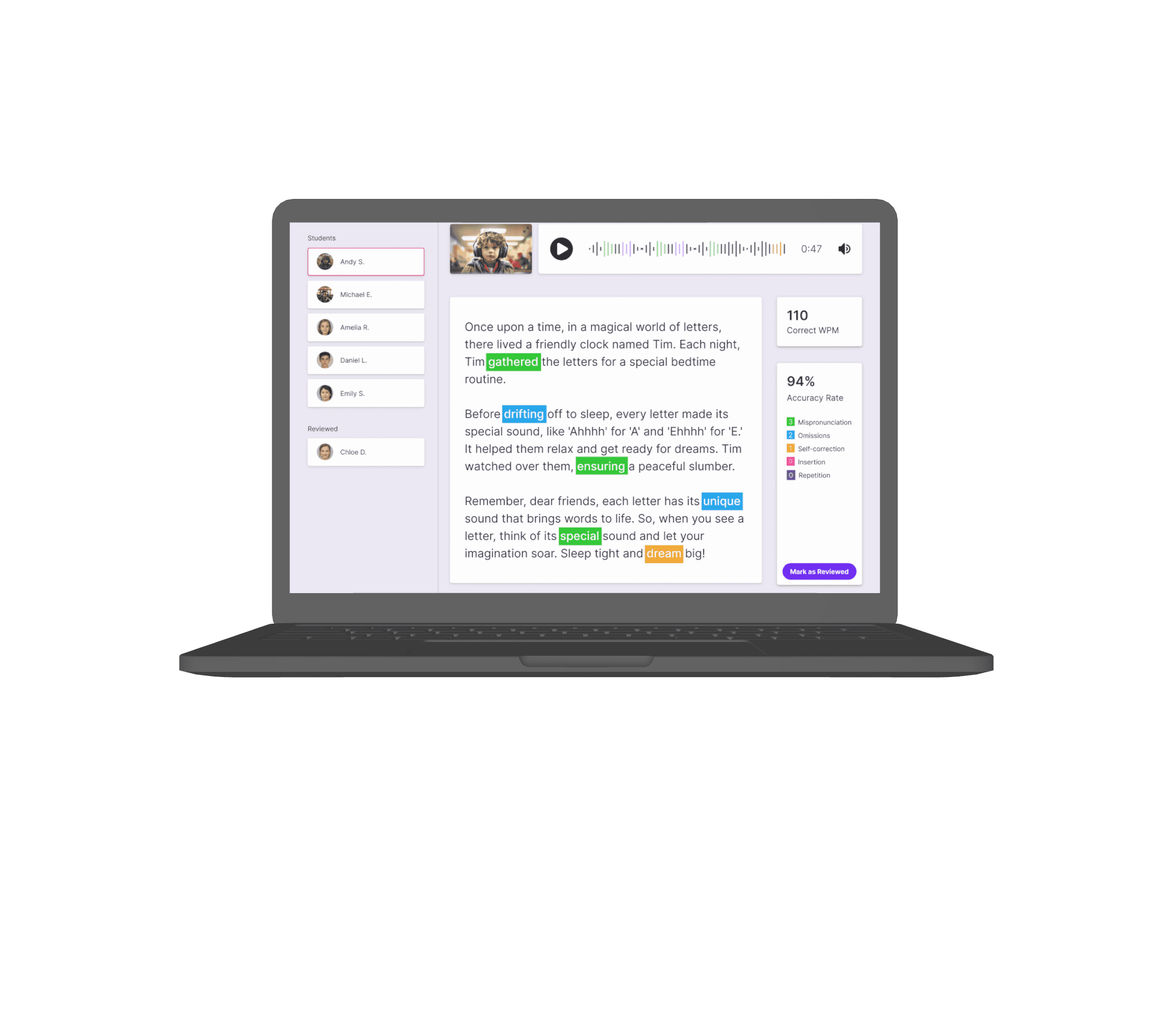
Usability Testing
With our second flow, we tested to see if users could find the analysis/results for two students from the most recent reading assessments. These are the results from our testing:
Users achieved 100% success rate and were able to identify and select the most recent assessment, as illustrated on this heat map:


On this heat map, we found that 3/5 users struggled to find the "Reviewed" button in the lower right corner.
Also, 5/5 users tried to interact with our media "Playback" tool. Although this feature wasn't made to be interactive in this test, it gave my team direction as to what features to build out and test next.
Hifi Wireframes
From our usability testing, my team took these results and started creating high fidelity wireframes that address the pain points from our low fidelity prototype testing. This is how the low fidelity and the high fidelity wireframes compare:
Moving on to our analysis/results page, revisions were made to the "Reviewed" button by re-designing it with higher contrasting colors (which also helped with accessibility) and changing the wording to "Mark as Reviewed" to encourage more interaction
Addressing our biggest fail from our usability testing, we moved the "Assess" button to a more prominent, visible spot on the screen and changed the wording to "Create Assessment" to try and eliminate any confusion on its function


Next Steps
Based on the results and feedback of the usability testing and client goals, our next steps for designing Reading Rocket include:
Conducting moderated usability testing on our high fidelity prototype to confirm that our new design resolves previous pain points
Research, design and test a flow surrounding printable study materials and certificates of achievements for students, accessible on the Assessment Analysis page
Additional interviews and collaboration with Subject Matter Experts to refine, finalize assessment and student progression metrics, implement a grouping system, and finalize the overall system copy.
Final Thoughts
Seeing this product come to life from mere concepts and ideas has taught me to take on a growth mindset and adapt to all of the twists and turns that come along with defining and designing Reading Rocket from the ground up. I couldn’t have asked for a better project to have lead our group in research, as we got to see our design form and continually evolve as we dug deeper into research and connected with more educators and experts. For this project in particular, research was vital and never ending and it showed me how crucial research really is.
I was very fortunate to have worked with involved stakeholders that have a background in AI technology for this project. This not only helped me continually iterate on the collaborative process and experience but helped me get my feet wet with the design process around Artificial Intelligence.